
design guide: root & render
-

when your site needs to be refined + refreshed
recognizing when it’s time to give your digital home a refresh
a website, like a living space, is meant to evolve with you. like a plant in a pot that’s become too small. your website can eventually feel cramped. what once fit your work perfectly may now be holding it back, leaving little room for your current purpose, direction and aesthetic.
you’ll know it’s time for a refresh + refine when:
the design no longer reflects the quality of your work, navigation feels cluttered or content has outpaced the space in which it lives, pages take too long to load or the layout doesn’t adapt well on mobile, the color palette, layout design or key sections no longer reflect the aesthetic or values of you now.whatever the signs, updating your online home isn’t starting over, it’s a natural part of growth — like moving a thriving plant into a larger pot, giving the roots room to stretch, the leaves space to catch more light and the ability to keep growing.
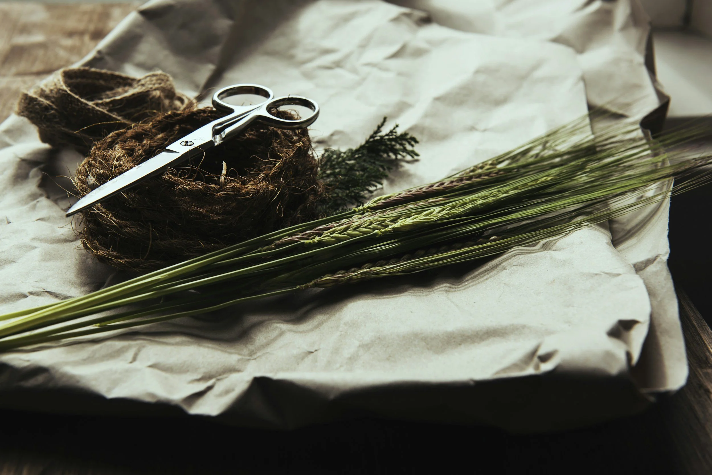
I focus on web design that allows your vision to stretch and thrive — planting, nurturing and unlimited growth.
-

single scroll vs multi page website designs
an intentional guide to choosing a layout that best serves your goals
every brand story has its own rhythm, and the way your website flows should match that rhythm. two common paths are single-page and multi-page designs… they each have their own strengths.
single scroll web design
best for simplicity. a smooth, single scroll journey where all of your content lives in one cohesive space. ideal for launches, single offerings or brands with minimal content that want to make a strong first impression without overwhelming the visitor.multi-page web design
perfect for depth. each page holds a distinct purpose, making it easier for visitors to explore at their own pace. works well for business with multiple services, growing resources or complex navigation needs.your website’s structure should feel as natural as the way you tell your story, whether that’s all in one breath, or with room to pause between chapters.
-
Rooting your brand online
why web design should feel like home
in a world of templates and trends, your digital space should be a reflection, not a replica.
your online presence is the living, breathing extension of your work. design that feels like home is more than a visual choice — it’s the texture of your brand, the rhythm of your words, the way visitors feel when they arrive. colors that hold warmth, layouts that breathe, details that invite curiosity — all of it shaping an experience that aligns with your purpose.
at terraform design, I approach every project as a grounding process. we start with the roots of your story. from there, we choose the elements that will help your vision grow: intentional color palettes, typography with personality, layouts that flow intuitively — grounded, intentional and true to you, while designed to grow with you. by showing up in the spaces where your audience naturally gathers, your brand can stand out in a way that feels effortless.
when your site feels like home, it’s not just a place people visit, it’s a space they remember.